Introduction
Making your checkout process easier is necessary for the life of your online course business. The easier and safer it is for students to checkout, the better they trust your course business. In this lesson, we’re going to analyze the e-learning checkout process. So how do customers turn into students when they go to your website, course, or community and actually pay and check out then buy that service you offer?
So that’s what we’re going into, and we’re going to dig into some of the possible problems and things you can do to improve and maximize your conversions on your checkout process.
Problems course creators can encounter if they don’t use the checkout process
- It can complicate the purchasing process for customers
- It can make their customers feel less secure
- It can ruin a course reputation as broken
- It reduces conversions on their website, community, service, or product
- It leads to the loss of customers to other competitors
Video Lesson – How customers takes steps paying for your services
What is Checkout Process?
This is the purchasing steps when your prospects (who aren’t your customers yet, but they will become your customers when they’re ready to buy your products and services) go through these screens to pay and finally receive access to the products and services they purchased. And that’s when they become your students and your clients. So those few screens where they actually pay, that’s the checkout process. That’s what we’ll dig into today.
Key Steps for Checkout Process
Here are the purchasing steps from when your prospects are ready to buy your course products to when they receive access as students:
Shopping: Features, Pain Point/ Transform, Previews, Alternative
First of all, let’s go over shopping. When they come in, they’re looking at the features. They see the pain points you talked about and some of the challenges the students are going through. They’re reading on your sales page about the transformation of what they’ll become and the capabilities they’ll get, or how a year from now they might have a new job or skills.
They’re reading all these on your landing page and are very interested. They see free previews of some of your lessons in the curriculum. They’re trying you out and may also have a couple of open tabs. They may be looking at other Google searches or competitors and thinking of their options. They like you, but they just want to double-check what else is out there.
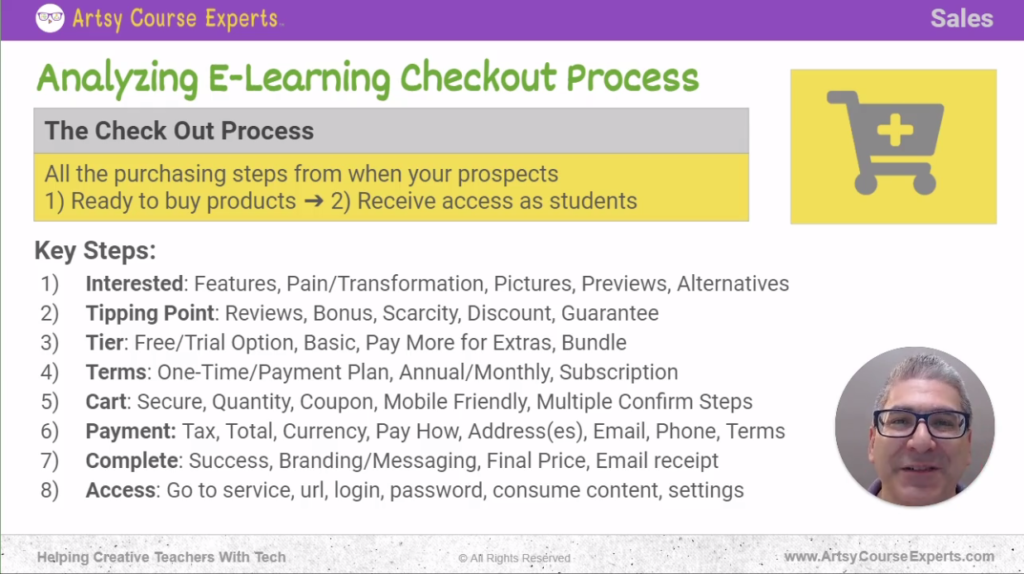
Tipping Point: Reviews, Bonus, Scarcity, Discount, Guarantee
The next step is that tipping point, where they’re starting to read your testimonials, reviews, and ratings from other prior students.
They may see bonuses that you offer. For example, some templates or swipe files. You might also include a limited-time offer.
There might be some scarcity options that you’re using, e.g., Cyber Monday, Black Friday, or some other big deal that’s happening and wrapping up in just a few days.
They need to make a decision. To help them with that, consider having some sweeteners with some discount or price slash.
On the landing page, you might have a guarantee. They already saw the testimonials, they see the discount, they see it’s expiring soon, and then you’re telling them, ‘no worry, no risk, there’s a guarantee here, and if it doesn’t work out, just let us know. We’ll refund you in some capacity.’
Tier: Free Options, Basic, Pay More for Extras
When they’re ready to make the next step, they need to decide what tier they might want from you.
In sales tiers there are levels that customers can buy. Each level goes up in price and has additional benefits. You might have a small, medium, or large, or you might have a free mini-course or something like that. And then, if the customers don’t want the free but want the full value there, they might have to decide.
Need Coaching? We Got You.
Level up your business with an experienced tech partner.

Check out our 1:1 personal pathfinder, small group leader Zooms, or quick technical audits.
Do they take the first basic plan or pay a little? Maybe you offer coaching, a course, a community, or some bundle where they get coaching.
Your students about to make a decision on which one they want, and then; they will go to their shopping cart. It could be on your website, community page, course, or wherever your various technology components and integration are. It doesn’t matter.
Cart: Quantity, Confirm Products/ Service, Coupons, Multi-Steps
When they make it to the cart, they’re ready to buy; This is where, hopefully, your browser or mobile device shows the lock icon that it’s secure. It’s HPS, and so it’s a secure protocol. They feel good; there are no hackers if they buy at an airport, a Starbucks, or something like that.
So they want to feel that your website is secure. They might have poked around your website, and by accident, they’ve increased the quantity to two, but they only want one. So that’s where on the cart they can double check that the quantity is one item they chose.
They’ll see that brief description. They’ll want to ensure that the cart is working on mobile, but they could buy on a tablet, not necessarily their desktop or cell phone. You want to make sure that your checkout process is mobile-friendly. For some reason, many e-commerce sellers like to have multiple confirmation steps.
For instance, the checkout process for a fashion course may have certain confirmation processes like ‘hey, here’s the card, look at the card, are you sure it’s in the card? Do you want to proceed? You could probably do that in fewer steps. So be on the lookout for how you can reduce the steps and the exit ramps off your checkout process.
They’ve chosen something, and they verify at that point. Their next step should be to give you their credit card. You want to prove those things.
Payment: Taxes, Prices, Currency, Pay How, Addresses, Terms
When you get to that next screen, the payment screen, you’ll want to show them any possible tax, the total of the current price with discount, and all that stuff. You may offer currency options, where they can see the number in a local currency. You may want to get rid of that and focus on your main currency, which is US Dollars.
Then you’re going to let them decide how to pay. You could take credit cards. You could also take some of the new mobile options like Google and Apple Pay. You might take PayPal again; as you’re adding these options, they might give them more capabilities. You’re also making your checkout process a bit more complex. So you need to balance your payment methods and the right amount without distracting the bulk of your prospects.
You may enter an address. This is the part on the website that has shipping. You’re probably not shipping stuff since we’re talking about digital products, but you might have your billing address versus your real address. Remember your billing address is connected to your credit card, so you need to make sure that there’s at least a zip code.
Complete: Success, Branding/ Messaging, Final Price, Email Receipt
You might want to have an email here. In some cases, send them a receipt in case there’s a problem. But in your case, you’ll set them up and give them instructions later for how to get to that service and do that digital download.
Of course, some people and businesses like to collect phone numbers, probably in case there’s a problem. But again, if you don’t need it and have the email, that might be good enough, and you may want to simplify your payment page. Just know those essential things – payment methods, address, email.
Some shopping cart systems or payment systems might have a variety of checkboxes at the end. “I agree to the terms.” You may or may not need that. I’m not a lawyer, but you can check that. Sometimes they’re excessive, and we can probably simplify the payment process and maximize the conversations that happen on your e-learning product.
After they make the payment, they click buy then eventually, they’ll see a complete success, and that should be branded. It has your message welcome and congratulations. Maybe you’ll give them the next step.
Access: Go to Service, URL, Login, Password, Consume Content, Settings
When the final payment is received. The next step is to give them directions to immediately access the products and services they bought. You want to give them access to your course so they can log in to the course.
You’ll kind of want to bridge them in. You don’t want to just hit them at a dead end there. The email should work as well because emails will provide them with a receipt. Then you’ll give them a nice welcome message with a great link and tell them, “hey, save this email for future reference. Bookmark this link to access your courses or your community, but you really want to bridge them into that access.
That’s where you’ll give them some tips also. “Hey, log in with that email you used to buy this service”. Also, let them know where to go, what page, or what email to use if you have any problems.
Alright, this summarizes the key steps and opportunities to optimize your checkout process for your courses, your communities, or even your coaching.
Common After Purchase Customer Needs
After your customer buys your course they may run into some problems. So as course business owners, we want to let our students know what to do if there are any problems. So you’ll have to think about problems in three ways:
Access Problems
Common access problems include; they can’t get to the course, they can’t get to the community, they don’t have the app, never got your email, etc. So these are some basic problems with access that you’ll want to have. If you can defend against them or get ahead of them, let them know in your email or on your checkout page where to go to get them.
Changes
A little bit later, there might be changes that happen. They might want to change their email, their password, or maybe it’s a subscription, and they might want to change their credit card or plan.
So somewhere in your ecosystem, whether it’s email or the checkout, or the dashboard and the welcome message, you’re going to let them know where to go so they can access their accounts and change anything they need.
Problems
Unfortunately, problems happen. You have to get ahead of that and let them know where to go if they lose the link to log in if their password isn’t working, if they got billed the wrong amount, or maybe something’s not working, and they want a refund.
So, in all these cases, for access, for changes, and for problems, you’ll want to let your students know where they can go to get more information, frequently asked questions, submit a ticket, et cetera.
Frequently Asked Questions on Analyzing E-learning Checkout Process

Summary – Analyzing E-learning Checkout Process
If set up correctly, the checkout process can help you maximize your conversions and customers on any digital product you wish to sell. This lesson will enable you to know the key steps to optimize your checkout process for your courses, communities, or coaching. You’ll also be able to make your checkout process easier and seamless for your customers and prospective clients.
Here are a few tips you should have in mind when preparing checkout process:
- Always set out the features of your courses and the problems that could be solved when students buy your course
- Including testimonials, reviews, and ratings in your checkout process will encourage students to buy your course
- Ensure your checkout process is mobile friendly
- Add an email or a page where your prospects can reach out to you when they have a challenge or problem
- Consider having a free course before the main course.
All right, now you’re smarter about the checkout process.
There are more resources in the notes. Please subscribe to get more tips for creative online course teachers. If you need tech help with your courses, your community, or your teacher’s website, visit www.artsycourseexperts.com.
More Tips For Online Teachers
These lessons can also help you with course planning, marketing, and sales:
- Signup Process Analysis
- Offering Course Payment Plan Options
- Using Title Slides for Online Course Lessons
- Stripe Payment Fundamentals For Online Course Teachers
- Handling Student Buyer’s Remorse For Online Courses
- Using Ratings And Reviews In Your Online Courses
- Set Up Teacher Website
Related Services For Teachers and Experts
We offer these services to help your course business with sales and planning coaching:
- Online Course Coaching
- Analyze Class Curriculum – Outline & Lessons
- Analyze Your Online Course SEO
- Course Technology Maintenance
- Community Technology Maintenance
- Virtual Chief Technology Officer (CTO)
- Build An Online Course

